Sunday, December 17, 2017

Graphics: Words + Images

I've always loved graphics that go beyond the level of literal meanings. I think graphics that incorporate literary devices such as metaphors, sarcasm etc to be some of the most intriguing and hilarious! The graphic below does just that....it primarily relies on the image of a suitcase etc to convey its meaning - as opposed to solely text. The humor in this graphic would not have been possible if the graphic was solely text-based. So it means that there are somethings images/pictures can say, meanings they can convey, that words would not quite achieve.

Image result for just in case

But I think the meaning/message is even more effectively conveyed when text is combined with images/pictures (Mayer, 2005) - much like the image above. The combination of words and images can help to communicate messages/meanings that either one could achieve/convey independently. The graphic below illustrates just that.....meaning is enhanced when different forms (sound, text, image) are incorporated. More than just appealing to the various senses (i.e. multi-sensory), combining different forms of communication into one graphic may either change, manipulate or reinforce the point/message one is trying to communicate. This is perhaps the whole premise upon which memes (the popular craze that has flooded social media within the past few years - and as I stated in previous posts, you guys know how much i love memes! #hilarious 😁😅😆).


Image result for this could be us meme


The image below is a fine example of this conflation. Without the text, for example, one may initially think this graphic is about love and possibly a successful marriage proposal. But the bold text tells us something quite different! It also adds to the emotions experienced by the ricipient/audience from one of love and calmness to one of laughter. The layering of text upon the image takes the graphic from being about strong/intense topics and emotions (love) to one that is less serious/intense (laughter). So this meme is definitely a mood-lifter (Clark & Lyons, 2011). Hahahaha.

Monday, December 11, 2017

Novice Graphics: Stop #HammerTime #RelaxABit

I've always loved when there's a move away from professionally done graphics to more novice or basic graphic creations. I find that such graphics often come with a certain level of creativity/innovation, context or specificity and humor (depending on how you look at it lol). The graphic below illustrates just that, incorporating all of these elements. A few years ago a similar graphic was created and found its way throughout (my country) Trinidad amidst controversy regarding a particular project the government was working on at the time. Persons spray-painted the traffic stop signs with "the smelter plant" instead of "Hammer Time" as seen below. That was an example of how a graphic (particularly one that is done by the average person) can be culturally specific, innovative and perhaps humorous all at the same time.

Image result for Stop Sign - the smelter

But for this week's post, I'd like to keep things very light-hearted. I find the design and entire graphic to be quite hilarious. But besides that, I think it is very applicable to the busy lives many of us lead, especially those of us who are always on the go - trust me, I know EXACTLY what that's like. I had quite a series of busy, demanding and stressful weeks that recently past. But in the midst of all of it, I had to find the time or take simple and short opportunities to stop, take a break and relax or #HammerTime ....even if it's just for a few minutes during the day. I think everybody needs a graphic like this at some point in time. If we follow what it says (despite its humorous amateur design), we might actually begin to live healthier or more balanced lives.

So the next time you are facing a stressful series of events, just remember to #Stop #HammerTime aka take some time to relax/ease your mind a bit.

Image result for Stop Sign - Hammer Time


Thursday, November 30, 2017

Graphic Functions: Transformational, Procedural & Prior Knowledge

For this post, I'd like to venture a bit into the different types of graphic and/or graphic functions as outlined by Clark and Lyons (2011). The inspiration for this came as I was doing a lot of graphical work in my job over the past few weeks....especially within the past two weeks to be exact. I was preparing materials for a few training workshops and projects that I was spearheading. To this end, I was creating, editing and appropriating different visuals to accompany these ventures. For example, I decided to use certain graphics in a workshop on brain-based learning or animations in education to engage my workshop participants while at the same time creating teaching points. I used different graphic illustrations to show them how colors and images etc can mess with the dendrites in their brains. In these cases, the graphics I used fulfilled decorative and informative functions (Clark & Lyons, 2011).

But because I have been in quite a mood for humor despite my immense work schedule (humor helps to reduce the stress), I decided to go with more lighthearted graphics for this post. Now if you've been following my previous posts, you'd know I just have a love for hilarious memes. You may find the memes below to be quite humorous, but more than that, they fulfill several other graphic functions outlined by Clark and Lyons (2011). They fulfill a transformation or procedural function (Clark & Lyons, 2011) as they illustrate a process or series of steps from one point/state through a process/transformation to a different end product. The images below have been quite the buzz on social media particularly within the past few weeks….making fun/parodies of unrealistic celebrity make-up transformations. They go from the average person with various imperfections go through a quick process to miraculously look like celebrities....have a laugh 😅😂😂😂😂.


Related image


Image result for makeup transformation memes

But in order to catch the humor in these memes, it helps if you are familiar with the celebrity they appear to look alike in the final part of each graphic. For example, in the last graphic, one may need to be familiar with the actor who plays Loki, the villain in the Thor as well as The Avengers movie franchises, to catch the joke. The humor is that the person really looks nothing like the actor/character but through some crazy, low-cost steps (like putting on a busted wig, using contact lenses etc) the high-priced celebrity look is easily/unrealistically achieved. And this brings us to the other function these graphics fulfill. They stimulate us to rely/use our prior knowledge. It plays on our prior knowledge of the celebrity (what he/she looks like, the work they've done etc)....and that easily, they graphics have a psychological function! Amazing huh? Here are some more for you to enjoy below:

Image result for makeup transformation memes


Image result for makeup transformation memes - beyonce

Image result for makeup transformation memes - beyonce


Friday, November 24, 2017

We Can Do This! #Motivation

This week I stumbled upon this picture and it resonated with me because I definitely needed some motivation! With literally just one line and a picture of a baby, it's as simple as simple can be. Nevertheless, there were some emotions I attached as a recipient of the document. I went from fear, sadness and frustration to feelings of trust and anticipation. This is why it became a source of motivation which I shared with two of my friends and they felt the same way.


Plutchik (1980) elaborates on the emotions that are triggered/experienced from graphics. According to Plutchik (1980), these emotions can be classified into four main categories:

  1. Joy and sadness, 
  2. Trust and disgust, 
  3. Fear and anger, and 
  4. Surprise and anticipation. 
The aforementioned emotions can influence how the message of a graphic can be received/interpreted/impact a viewing audience. The use of a baby, the baby's face and clenched hands/fist, as well as the baby's clothes and background of the sea, and even the text style and size and exclamation mark all connect with human emotions. For example, the use of the baby, the baby's face and clenched hands/fist, as well as the baby's clothes not only grasps attention but triggers emotions such as joy and determination or resilience. This is perhaps the reason this graphic was a major source of motivation (Plass, Heidig, Hayward, Homer, & Um, 2014; Moreno & Mayer, 2000) to my friends and I not just while exercising together (because we run up hills etc for fitness) but also in our everyday lives .

So whatever challenges you might be facing, do like the child in this picture and know that "YOU CAN DO THIS!" - if a baby can do it, then so can you!😀😂🙆

Saturday, November 18, 2017

Using Graphics: Explaining the Elephant Theory & Learning Theories

This week, I was conducting another faculty development/training workshop, and I was trying to explain several theories that inform educational practices (learning theories). These theories included Cognitivism, Behaviorism, Constructivism, Social Learning Theory etc. After I gave a synopsis of each theory, I was trying to make the point that each of these theories are needed/ should inform their instructional practices. To do this, I wanted to use something that they may be able to relate to - The Elephant Theory!


The Elephant Theory was not something I had known before, so it was a risk trying to use it in the workshop in the first place (I was so nervous). But this graphic was a huge help in helping me explain/summarize the theory without going into much detail.

The Elephant Theory states that the blind men were all touching/focusing on different parts of the elephant (eg the tail) and concluded that the elephant felt like unrelated things (eg a wall) based on what they felt with their hands. But the point I was making is that each component of the elephant that they felt (despite their perceptions) made up/accounted for the entire elephant - similar to the way educational/learning theories work.

I used the aforementioned image with the video below to provide some clarity. The video had additional images with text and voice. It is important to note that I designed the sequence of the graphics in such a way that the video illustrated the elephant theory/poem, and the image was used to illustrate the point I was trying to make regarding the parts of the elephant and learning theories.

By the end of both graphics, they totally understood what I was trying to do as they subsequently explained it back to me. The moral here is that sometimes graphics can be more effective when they are layered with different modes/types (e.g. a still image with a video as opposed to a video alone). #graphics #MessageDesign


Sunday, November 12, 2017

Instructional Message Design: The Laws of Simplicity - The One

Let's delve into the final law of simplicity according to Maeda (2006) - the one! Maeda (2006) summarizes this law by stating that "simplicity is about subtracting the obvious, and adding the meaningful." (p. 89). This pretty much sums up all of the laws of simplicity, and all of the laws discussed in this blog thus far. By focusing on meaning (ensuring that the message is clearly and unmistakably communicated...and removing distractions/ambiguity/complexity), one should aim for a simple approach. "Simplicity is hopelessly subtle, and many of its defining characteristics are implicit" (Maeda, 2006, p. 89), and this is what i love about simplicity....that things can be so subtly profound/effective yet easy to comprehend/execute.

Image result for KISS - Keep It Simple Stupid

A few weeks ago someone told me this acronym that they called "The KISS Principle" which means "Keep It Simple Stupid" (Dalzel & Victor, 2007)....and I think that pretty much sums up what Maeda (2006) has been trying to say all along.....just keep it simple....

PS: But I couldn't help but think about Maeda's (2006) laws of simplicity when I was introduced to that KISS principle/acronym a few weeks ago. I think it makes it easy to remember the essence of the laws of simplicity! Hahahaha. 😎😉

Thursday, November 2, 2017

Instructional Message Design: The Laws of Simplicity - Failure

For this post, I'd like to look at Maeda's (2006) laws of simplicity as it pertains to the law of failure. Here, Maeda (2006) acknowledges the likelihood of failure to make a message any simpler/less complex....and as such, I personally see this law as the law of exceptions. According to Maeda (2006) "there’s always an ROF (Return On Failure) when you try to simplify—which is to learn from your mistakes" (p. 83).


Image result for failure


I find this law to be a principle of life....that failure is a part of life....and more than just failing, it's about learning from your mistakes. I always like when I can make a link between educational technology and real life.....sometimes I do get frustrated when I'm used to using a particular software to deliver a certain message (e.g. Microsoft Word, PowerPoint or Excel) and I encounter some functionality that either fails/becomes difficult to resolve, and it leaves me like....

Image result for frustration


lollllll......but I soon take a #timeout and come back to the situation apply Maeda's law to learn from my mistake.....for example, to ask for help or try a different machine etc....or just accept it as a failure, learn, and move on, and be like 😁😁😁😁

So failure is a part of life....but it's also an integral part of effective message design!....and becomes essential if we learn from our mistakes.


Sunday, October 29, 2017

Instructional Message Design: The Laws of Simplicity - Trust

For this post, I'd like to focus on Maeda's (2006) law of trust. In his discourse on trust as a law of simplicity, Maeda elaborates on the ways in which predictive textual platforms for example, sometimes require some degree of trust. More than just graphical designs and imagery, videos etc, this law focuses on the information details that various media platforms can predict and insert without you having to type/insert anything - talk about intuition! LOL.

But more than the information, Maeda (2006) states that sending/communicating predictive information inserted by your technology/media device to another person (especially if it's something that you choose not to read before sending it) requires a significant deal of trust. So the question I now ask, do you trust your media device (phone, computer etc) enough to send messages (sometimes automatically) on your behalf?

In essence, what your device is probably trying to do is to make things easier....more efficient...more convenient for you. Upon reviewing this law I immediately remembered the many accounts and passwords my computer logs in automatically....I couldn't explain it via text but I knew exactly what I was trying to say/communicate, and the image I had in my head. So when I saw this graphic below, it hit the nail on the head!😄😅🙌🙌🙌🙌 - it's exactly the image I had in mind when I was re-reading this law....and I use this media feature almost all the time because it just helps to make life #simpler and with my busy schedule, that's just what I need #lawsofsimplicity 😃😁😀😎😅


Image result for username


Even this blogging platform, I learned a while now how to schedule blog posts in advance....so posts can be created and automatically published at a subsequent date as Maeda (2006) acknowledges...and that requires the element of #trust #insimplicitywetrust


Monday, October 23, 2017

Instructional Message Design: The Laws of Simplicity - Emotion


Related image

This week, I'd like to focus on Maeda's (2006) seventh law - Emotions. This law will require us to go beyond the basic level of black and white (paper and text) and add embellishments that convey further details such as the emotions that go along with the message we are trying to communicate. Maeda (2006) encourages the use of emotions in message design, and one of the things that stood out to me while reading that chapter/section in his book was the common proverb that "feeling follows form".

Reading this immediately had me thinking about the range of emojis I frequently use on several digital/mobile platforms such as Watsapp, Facebook, Instagram etc. The graphic below illustrates the range of emotions that I typically use multiple times...roughly every day I use these emojis/emoticons....especially in regular conversations with my family, friends, colleagues etc on Watsapp....and this platform provides quite a diverse collection of emojis to pull from (see below):

Related image

I find that they allow me to add a bit of my personality into the messages I'm communicating and certainly help in conveying feelings/emotions such as the feelings of happiness, confidence, frustration, sadness etc. I also use them to communicate higher level (figurative/metaphorical) messages. For example, if I'm trying to use sarcasm, humor just or just throw "shade" (as I explained in a previous post) I might use these:
 

It  seem strange but very often in these conversations I may not need text but just rely on emojis to convey my messages. This definitely showcases the interpretational function of graphics (Clark and Lyons, 2010). I think this is precisely why Maeda (2006) acknowledged the law of emotions as one of his ten laws of simplicity in message design. It's hard for me to break the ice, or be informal and loosen up with someone without the use of emojis via online/distant communication, so I agree with Maeda (2006). I've also found that GIFs are great ways of including emotions in messages....and these are quite common on social media platforms (as you can probably tell, I'm a HUGE fan of emojis, GIFs etc in my social media/mobile messages lol). 

With the GIFS below, tell me what kinds of emotions do you gather/interpret, and how would you use them in your message designs?


This second GIF I used in last week's post on context, so I'm interested to see what emotions might you attach/interpret from this GIF below. Hahaha.....and here is perhaps where we can see multiple laws that we previously discussed (e.g. time, reduction, context, emotions) being combined in one message/graphic.


Thursday, October 12, 2017

Instructional Message Design: The Laws of Simplicity - Context

This week I'd like to focus on John Maeda's sixth law of simplicity, which is the law of context. We live in a world where ambiguity, misinterpretations etc have become so easily the norm, that to me, context is everything!😮

For Maeda, context is what brings different things into focus at different times...even on the same graphic. Context may even bring things from the foreground into the background and vice versa. I liken it to when I'm trying to have a conversation with someone and instead of focusing/paying attention to what I'm saying, they focus on other "background" elements such as my tone of voice (how I'm saying it), what I might be wearing, or even on details of the immediate surroundings such as a ringing cellphone, a ringing doorbell etc. For Maeda, these may not necessarily be distractions, because "that which appears to be of immediate relevance may not be nearly as important compared to everything else around" (Maeda, 2006, p. 54).

So with this principle in mind, I started looking to see instances where this actually occurs....and I thought it would be quite difficult to find such an occasion, but it turned out to be much easier than I thought. The image below was taken by a friend of mine who wanted to highlight the intense game of volleyball we were playing on the beach a few years ago - all friends of mine despite the intense competitiveness lol. But upon looking at the image (which was meant to show us having fun playing volleyball), I was soon preoccupied with the sky (the dark clouds that created the overcast conditions)...I remember looking at the picture with one of my friends in this picture who I was tutoring with his Geography studies at the time.....and it became an illustration for him to describe the atmospheric conditions that normally precede rainfall (e.g. cloud type etc). So for us, our preoccupation and love for Geography 😍😍😍 (context) influenced us to see/focus on the background of the image (such as the dark cloud cover) as opposed to focusing on the main reason the picture was taken to illustrate. Our geographical context allowed us to focus on the periphery than on the primary/original motif behind the picture.....and this is how Maeda's law of context may function.


Image may contain: one or more people, ocean, beach, sky, outdoor and nature


I think this has implications on the way we understand the various communication functions of graphics, videos and online messages as outlined by Clark and Lyons (2010). Clark and Lyons (2010), identified these communication functions could be decorative, representational, relational etc. But I think context can definitely influence how much we focus/identify these various aspects of graphics.....for example, if I'm into visual Art (context), the image above might have more of a decorative emphasis for me......if I'm into tourism, or living in winter conditions (context) I may focus on the peripheral things such as the sea, the sand and sun, as opposed to the fact that volleyball is being played.

So focusing on this principle, has really helped me to have a totally new respect/regard for context not just in terms of text, but also in terms of graphic designs.

Your Turn:
Based on the aforementioned, what do you focus on in the graphics below....and feel free to explain what led you to focus on it:

Here's one:


Here's another:
Image result for minions


I'm excited to see below what peripheral detail (make-up, facial expression or specific minion) stood out to you and why (context e.g. a memory or relationship etc). 😂


Saturday, October 7, 2017

Instructional Message Design: The Laws of Simplicity - Difference

For this week, I'd like to focus on Maeda's fifth law - the law of difference. In a nutshell, this law states that simplicity and complexity need each other....in other words, things can't be too simple/simplistic neither too complex #balance I know for me, if something is either one of the extremes, I get turned off like 😐 lol.

Anyways, while thinking about this particular law, and looking at the recent series of hurricanes that hit several parts of the Caribbean and the US, I came across this short presentation (see below) that illustrated what seems to be a complex set of terminologies and information into a simple presentation that's easy to follow/understand.


 If I were to use the various functions of graphical communication put forward by Clark and Lyons (2010, I would say that this presentation is not only for informative purposes, but it also fulfills other representational and relational functions while minimizing cognitive load. In so doing, it simply explains what are hurricanes, what are hurricane categories, what does each category mean, what does it look like, and the correlational effects each hurricane category brings on property and human life. I think I could show this video even to my cousins who are still adolescents...one is not even 9 years old, and they would all understand and appreciate this video.

Saturday, September 30, 2017

Instructional Message Design: The Laws of Simplicity - Learn

Thus far, I expounded on three of the seven laws of simplicity from Maeda (2006). Now I'd like to look at the fourth law (Learn). This particular law states that knowledge makes everything simpler. I therefore liken learning and simplicity which should go hand-in-hand (especially when it comes to graphics and digital messaging #thesimpler #thebetter Something doesn't have to be overly complex and exhaustive in order to be informative for example. I am usually more attracted to learning experiences that are informal, humorous and simple....those resonate the most to me....when learning is unexpected.....flavored with a little humor.....but has substance/a solid message.

I recently came across some readings by Clark and Lyons (2010) who elaborated on the various communication functions of graphics, videos and online messages. According to Clark and Lyons (2010), these communication functions could be decorative, representational, relational etc). In my previous blog post, I mentioned my love for memes, so it's only natural and fitting that I came across this meme (below).

Image result for meme - when all you bought was healthy food
A friend sent this meme to me via watsapp. As simple as this graphic is, I find it very insightful on several levels. My friend was empathizing with me because we were hungry for junk food but were both hesitant knowing that its not the best food to eat #thestruggle.

What I learned from this meme is that sometimes (or perhaps more often than not lol) the best tasting foods are not always the healthiest foods to eat....not everything that tastes good is good for you. Additionally, perhaps on broader scale, I applied the message in this meme to life #lifeprinciple ....sometimes the most enjoyable things in life are not good for you.

Another #lifeprinciple from this simple meme is that sacrifices must be made for the meaningful stuff....anything worth having is worth fighting/working/sacrificing for.....It means that sometimes sacrifices need to be made in order to achieve a goal. I liken it to my current academic and educational pursuits.....in order to accomplish my goals in this regard, their are some sacrifices I continue to make. For example, I miss all the good stuff/times my friends are having at the moment because I have to complete a series of readings, assignments etc....but it's all for a goal! So as simple as a message may be packaged (eg the meme above), learning can still be accomplished!

PS: I also found that graphics such as mneumonics are quite effective in the facilitation of learning (Clark & Lyons, 2010). See some of these below:


Below is the mnemonic my school teacher used to help us learn/remember the colours of the rainbow:
Image result for ROYGBIV


So graphics allow us to learn from the smallest/simplest of things.


Sunday, September 24, 2017

Instructional Message Design: The Laws of Simplicity – Time


Many of my friends and I were quite active on watsapp sending and receiving numerous memes. I normally limit these but last week I guess I just needed a little extra moments to laugh, so I’d usually send memes with the hashtags #morninglaughter (if I’m sending them in the morning), and #eveninglaughter (if I’m sending them in the evening).

For this post, I’d like to look at Maeda’s (2006) law of simplicity with regard to time, and the new internet/social media craze or trend regarding memes. Similar to Twitter, Memes are some often use a minimal number of words combined with images to convey a message – this message might be an emotion, thought, expression etc. Like tweets, memes are never meant to be wordy, but concise and often denote humor in the form of sarcasm, metaphors, or even “shade” (shade is a contemporary term in popular culture referring to any kind of under-handed or subliminal insult/jab at someone).  In addition to being concise, humorous/insulting and visually based, memes must be contextually specific….the message and its meaning must be grounded in some socio-cultural context – usually this is a recent event, television show, or character/personality.

The thing about memes, is that they use some of the most hilarious and/or iconic images to further convey the meaning/message. Very often the image is used as a visual translation of the 
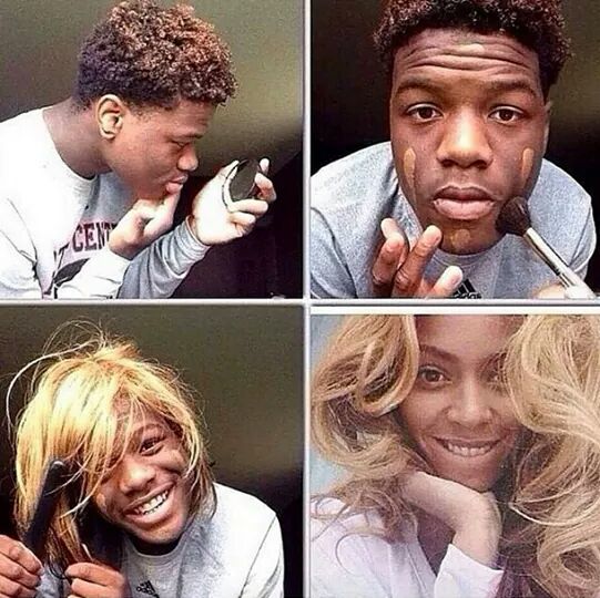
text or vice versa.  The meme below is a perfect example of all these traits that I’ve observed in the memes I’ve come across, and the ways in which they are used #laughter #funny:


Funny isn’t it? -- this was actually a meme a few colleagues and i shared to describe persons who will never change #nomatterwhat or to allude to an age-old proverb that you can't teach an old dog new tricks....I also used the same meme to convey a different meaning to my colleagues that I'm jokingly a "thug" or "bad boy" or "gangster" (which was hilarious because they know I'm not a thug etc lol :-) )

Memes reinforce several proponents of Maeda’s (2006) laws of simplicity. Not only are they simple, and concise (as we discussed in previous posts), but because of this they are also efficient as they convey they message/meaning in the shortest/quickest way possible.


I actually had a conversation with a very good friend of mine just using memes via watsapp. We used memes to relay information, create humour or “shade”, and we even used it to end the conversation….it definitely had me glued to my phone with excitement just waiting for the persons’ responses and what memes that person would use……it was soooooo much more engaging than a regular text-based conversation on watsapp. I also had a similar conversation with a couple of other friends in a watsapp group. Because of those two conversations, I’ve created a folder with dozens of memes for future conversational use, but I haven’t actively used the folder of memes since then….considering Maeda’s (2006) laws and my recent readings, I think it’s something I should resume with immediate effect!

Since I like memes so much, here are some others below which I used in different contexts for different motives and meanings, and shared with different people: #enjoy lol

After a friend sent this to me, I jokingly shared this with my other friends who probably shared the same sentiments about having to show up for work after the eclipse. 


My colleagues and I used this to trigger a conversation about persons/colleagues who ate uncontrollably at a formal event. This soon led to a conversations about other situations where our families and friends who often eat a lot, and about creativity.


This was one that I received from a friend, and then i shared it with other friends (including married persons) just to get a reaction. While the male recipients reacted by identifying with the male/silent bird, saying that it couldn't be more accurate, the female recipients often found it as a distortion of reality/the truth. I guess this meme could have perhaps triggered a future research project and/or publication? #hmmm


A friend sent me this one in response to my post about Elmo and the eclipse (see above)....it was a kind of competition to see who could out-meme each other based on the text/message, the image, and the creativity of the meme in light of the eclipse that occurred that day.


A colleague sent this one to me via watsapp when she was about to go on her leave. lol.....I think it's something we can perhaps all relate to when any vacation comes lolll.


As you can tell, I think memes are some of the most creative and engaging ways to convey a message (even if it is for instructional, marketing or other purposes). If you like any of these memes, you can access these and more via social media such as Facebook and Instagram and you can create them yourself via the numerous free online meme-generators. #happymeming :-)


Friday, September 22, 2017

Instructional Message Design: The Laws of Simplicity – Organize

Instructional Message Design: The Laws of Simplicity – Organize

In the previous post, I elaborated on Maeda’s (2006) law of simplicity as it pertains to reduction, and connected that law to the complex processes and website navigation at an institution I am very familiar. In this current post, I’d like to elaborate on the same series of websites through another one of Maeda’s (2006) laws – the law regarding organization. This law states that proper/effective organization can help make a system of many things appear fewer…..no, it’s not fraud/trickery lol😁.

As I thought upon this principle, it reminded me of the saying that “first impressions count”……in my previous post I stated that when I encounter websites that are complicated etc I simply close them down and continue searching for a simpler site of instructions. This I’m sure is what many people do, especially if you’re always on the go like me.

This week had a few members of faculty come to me for some one-on-one training via a series of clinics on accessing the campus’s LMS and setting up their online courses. Even though they were randomly from different departments, fields, etc, they ALL had an issue relating to organization of online content. While some complained that the campus’s websites were way too cluttered with an abundance of unnecessary information and links etc, others created online courses that were perhaps even more so cluttered with assignment instructions, announcements etc….which I’m sure is off-putting to their students. So while they may find the campus’s websites off-putting….their students sometimes find their online courses rather off-putting....logging in, hit by the vast onslaught of disorganized content like a head-on collision with a truck, and left feeling like....

Image result for confused emoji


.....that's exactly what I feel as well when I visit those course sites as well.

As I relate this situation to me, I remember many times logging into the faculty’s courses and immediately feeling overwhelmed by the information that hits me upon entering their courses….so one can only imagine how their students feel. That said, I think Maeda’s law of simplicity regarding organization is necessary because it relates even to the layout and design of content on a webpage. I think if this law were applied to my context, the websites (both administrative and course/LMS sites) will be much cleaner, less cluttered, and persons become more receptive to the web content when they visit the sites – as opposed to leaving the site or ignoring the important announcements. Like me, I’m sure no one wants something that is confusing and draining to read, let alone understand….that’s why Maeda advises on keeping things simple….and this may relate to the organization of web-content in my professional context....keeping it simple helps to keep it clean/well-organized...and to this end, planning is essential.

Image result for a well organized site

Tuesday, September 19, 2017

Instructional Message Design: The Laws of Simplicity - Reduction

Instructional Message Design: The Laws of Simplicity - Reduction

Maeda (2006) proposed ten (10) laws of simplicity inform instructional design for online learning. The laws are listed below:
THE TEN LAWS OF SIMPLICITY
Reduce: The simplest way to achieve simplicity is through thoughtful reduction.
Organize: Organization makes a system of many appear fewer.
Time: Savings in time feel like simplicity.
Learn: Knowledge makes everything simpler.
Differences: Simplicity and complexity need each other.
Context: What lies in the periphery of simplicity is definitely not peripheral.
Emotion: More emotions are better than less.
Trust: In simplicity we trust.
Failure: Some things can never be made simple.
The one: Simplicity is about subtracting the obvious, and adding the meaningful.

The laws of simplicity posit that multimedia messages should be designed in a way that is clear, well-organized, logical and easily understood by the intended audience, as opposed to presenting and designing information arbitrarily with great ambiguity. 

Law 1: Reduce
In this week’s post, I’d like to focus particularly on the first law which is the law of reduction. Maeda (2006) suggests making things as simple as possible and removing unnecessary complexity. I am currently employed at a university that is heavily influenced by the British education system, and very often in the academic world there is the tendency to make things unnecessarily complex/complicated…and I’m not sure exactly why that may be the prevalent trend. This ranges from basic instructions to access or use a particular service or platform to directions for finding a classroom on my campus, and even in coursework instructions. It may be limited to my local university contexts, but for some reason there tends to be the misconception that being wordy, providing an abundance of information all at once and generally making things seem complicated/complex is assimilated to being profound, learned or an academic. But according to Maeda, effectiveness is not based on being unnecessarily complex, but it is really based on keeping things as simple as possible. To this end, Maeda proposes the following continuum:
how simple can you make it?    ⇔       how complex does it have to be?
If the goal of instruction is to ensure that the intended audience/target group understands the message, shouldn’t that message be articulated in a simple manner to reduce ambiguity and enhance accurate comprehension? #justmytwocents 

Working as an eLearning Support Specialist, I encounter many websites which include websites affiliated with my university, as well as my Google applications etc. One thing that I find somewhat off-putting is the abundance of instructions when all I want is to access the site/feature😒😑😦. Very often when I see overly complex instructions, I just close the window and find simpler route/site/application.....some might see this as laziness, but I see it as trying to keep it simple for me to understand (simplicity and efficiency) 👀😊

The images below illustrate an educational site that students have to navigate just to get to the affiliated Learning Management System or LMS (see previous post on LMS). This can often be a long, pedantic and in my opinion an unnecessarily complicated and inefficient process, particularly for someone who just wants to access the LMS for a quick review of something, or to submit a project....it's almost like a simple goal/task that has been made super complicated - unnecessarily😦😩 #why.

Accessing the LMS at a particular institution:

1.      Access the campus’s main page and select a campus for which you are enrolled (see below)


2.      A new window will appear. Insert your login credentials to enter the site. Click on the MOODLE icon to access the campus’s LMS (this tiny icon may be hard to find in such a complex/busy page).


3.      A new window will appear. Insert your login credentials to enter the campus’s LMS (note, if it is your first time logging in, you will automatically be prompted to change your password which will require you to open/check your university email account)

A more efficient approach would be to simply direct users to the specific site they would like to visit, and eliminate all the directions to the other sites that they need to navigate before getting to the desired site – in other words, eliminate the need to visit the first two sites below and simply have students go directly to the third site/illustration. This is where Maeda’s (2006) law of simplicity may be quite applicable, using the first law of reduction to reduce the steps and/or sites to access the LMS to one single step – to go straight to the campus’s LMS site and login.

In conclusion, Maeda’s (2006) law of simplicity regarding reduction can be applied not just to educational instruction, but it may be applied to other fields and aspects of life e.g. human/personal relationships. Sometimes you can say a lot and increase efficiency by keeping it simple. Never complicate the simple things in life.

Justin Z.

References:
Maeda, J. (2006). The laws of simplicity. Cambridge, MA: MIT 

https://designopendata.files.wordpress.com/2014/05/lawsofsimplicity_johnmaeda.pdf