Thursday, November 30, 2017

Graphic Functions: Transformational, Procedural & Prior Knowledge

For this post, I'd like to venture a bit into the different types of graphic and/or graphic functions as outlined by Clark and Lyons (2011). The inspiration for this came as I was doing a lot of graphical work in my job over the past few weeks....especially within the past two weeks to be exact. I was preparing materials for a few training workshops and projects that I was spearheading. To this end, I was creating, editing and appropriating different visuals to accompany these ventures. For example, I decided to use certain graphics in a workshop on brain-based learning or animations in education to engage my workshop participants while at the same time creating teaching points. I used different graphic illustrations to show them how colors and images etc can mess with the dendrites in their brains. In these cases, the graphics I used fulfilled decorative and informative functions (Clark & Lyons, 2011).

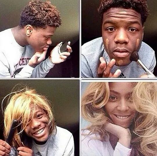
But because I have been in quite a mood for humor despite my immense work schedule (humor helps to reduce the stress), I decided to go with more lighthearted graphics for this post. Now if you've been following my previous posts, you'd know I just have a love for hilarious memes. You may find the memes below to be quite humorous, but more than that, they fulfill several other graphic functions outlined by Clark and Lyons (2011). They fulfill a transformation or procedural function (Clark & Lyons, 2011) as they illustrate a process or series of steps from one point/state through a process/transformation to a different end product. The images below have been quite the buzz on social media particularly within the past few weeks….making fun/parodies of unrealistic celebrity make-up transformations. They go from the average person with various imperfections go through a quick process to miraculously look like celebrities....have a laugh 😅😂😂😂😂.


Related image


Image result for makeup transformation memes

But in order to catch the humor in these memes, it helps if you are familiar with the celebrity they appear to look alike in the final part of each graphic. For example, in the last graphic, one may need to be familiar with the actor who plays Loki, the villain in the Thor as well as The Avengers movie franchises, to catch the joke. The humor is that the person really looks nothing like the actor/character but through some crazy, low-cost steps (like putting on a busted wig, using contact lenses etc) the high-priced celebrity look is easily/unrealistically achieved. And this brings us to the other function these graphics fulfill. They stimulate us to rely/use our prior knowledge. It plays on our prior knowledge of the celebrity (what he/she looks like, the work they've done etc)....and that easily, they graphics have a psychological function! Amazing huh? Here are some more for you to enjoy below:

Image result for makeup transformation memes


Image result for makeup transformation memes - beyonce

Image result for makeup transformation memes - beyonce


Friday, November 24, 2017

We Can Do This! #Motivation

This week I stumbled upon this picture and it resonated with me because I definitely needed some motivation! With literally just one line and a picture of a baby, it's as simple as simple can be. Nevertheless, there were some emotions I attached as a recipient of the document. I went from fear, sadness and frustration to feelings of trust and anticipation. This is why it became a source of motivation which I shared with two of my friends and they felt the same way.


Plutchik (1980) elaborates on the emotions that are triggered/experienced from graphics. According to Plutchik (1980), these emotions can be classified into four main categories:

  1. Joy and sadness, 
  2. Trust and disgust, 
  3. Fear and anger, and 
  4. Surprise and anticipation. 
The aforementioned emotions can influence how the message of a graphic can be received/interpreted/impact a viewing audience. The use of a baby, the baby's face and clenched hands/fist, as well as the baby's clothes and background of the sea, and even the text style and size and exclamation mark all connect with human emotions. For example, the use of the baby, the baby's face and clenched hands/fist, as well as the baby's clothes not only grasps attention but triggers emotions such as joy and determination or resilience. This is perhaps the reason this graphic was a major source of motivation (Plass, Heidig, Hayward, Homer, & Um, 2014; Moreno & Mayer, 2000) to my friends and I not just while exercising together (because we run up hills etc for fitness) but also in our everyday lives .

So whatever challenges you might be facing, do like the child in this picture and know that "YOU CAN DO THIS!" - if a baby can do it, then so can you!😀😂🙆

Saturday, November 18, 2017

Using Graphics: Explaining the Elephant Theory & Learning Theories

This week, I was conducting another faculty development/training workshop, and I was trying to explain several theories that inform educational practices (learning theories). These theories included Cognitivism, Behaviorism, Constructivism, Social Learning Theory etc. After I gave a synopsis of each theory, I was trying to make the point that each of these theories are needed/ should inform their instructional practices. To do this, I wanted to use something that they may be able to relate to - The Elephant Theory!


The Elephant Theory was not something I had known before, so it was a risk trying to use it in the workshop in the first place (I was so nervous). But this graphic was a huge help in helping me explain/summarize the theory without going into much detail.

The Elephant Theory states that the blind men were all touching/focusing on different parts of the elephant (eg the tail) and concluded that the elephant felt like unrelated things (eg a wall) based on what they felt with their hands. But the point I was making is that each component of the elephant that they felt (despite their perceptions) made up/accounted for the entire elephant - similar to the way educational/learning theories work.

I used the aforementioned image with the video below to provide some clarity. The video had additional images with text and voice. It is important to note that I designed the sequence of the graphics in such a way that the video illustrated the elephant theory/poem, and the image was used to illustrate the point I was trying to make regarding the parts of the elephant and learning theories.

By the end of both graphics, they totally understood what I was trying to do as they subsequently explained it back to me. The moral here is that sometimes graphics can be more effective when they are layered with different modes/types (e.g. a still image with a video as opposed to a video alone). #graphics #MessageDesign


Sunday, November 12, 2017

Instructional Message Design: The Laws of Simplicity - The One

Let's delve into the final law of simplicity according to Maeda (2006) - the one! Maeda (2006) summarizes this law by stating that "simplicity is about subtracting the obvious, and adding the meaningful." (p. 89). This pretty much sums up all of the laws of simplicity, and all of the laws discussed in this blog thus far. By focusing on meaning (ensuring that the message is clearly and unmistakably communicated...and removing distractions/ambiguity/complexity), one should aim for a simple approach. "Simplicity is hopelessly subtle, and many of its defining characteristics are implicit" (Maeda, 2006, p. 89), and this is what i love about simplicity....that things can be so subtly profound/effective yet easy to comprehend/execute.

Image result for KISS - Keep It Simple Stupid

A few weeks ago someone told me this acronym that they called "The KISS Principle" which means "Keep It Simple Stupid" (Dalzel & Victor, 2007)....and I think that pretty much sums up what Maeda (2006) has been trying to say all along.....just keep it simple....

PS: But I couldn't help but think about Maeda's (2006) laws of simplicity when I was introduced to that KISS principle/acronym a few weeks ago. I think it makes it easy to remember the essence of the laws of simplicity! Hahahaha. 😎😉

Thursday, November 2, 2017

Instructional Message Design: The Laws of Simplicity - Failure

For this post, I'd like to look at Maeda's (2006) laws of simplicity as it pertains to the law of failure. Here, Maeda (2006) acknowledges the likelihood of failure to make a message any simpler/less complex....and as such, I personally see this law as the law of exceptions. According to Maeda (2006) "there’s always an ROF (Return On Failure) when you try to simplify—which is to learn from your mistakes" (p. 83).


Image result for failure


I find this law to be a principle of life....that failure is a part of life....and more than just failing, it's about learning from your mistakes. I always like when I can make a link between educational technology and real life.....sometimes I do get frustrated when I'm used to using a particular software to deliver a certain message (e.g. Microsoft Word, PowerPoint or Excel) and I encounter some functionality that either fails/becomes difficult to resolve, and it leaves me like....

Image result for frustration


lollllll......but I soon take a #timeout and come back to the situation apply Maeda's law to learn from my mistake.....for example, to ask for help or try a different machine etc....or just accept it as a failure, learn, and move on, and be like 😁😁😁😁

So failure is a part of life....but it's also an integral part of effective message design!....and becomes essential if we learn from our mistakes.